Huawei Global Social Brand Refresh

2019
Branding | Art Direction

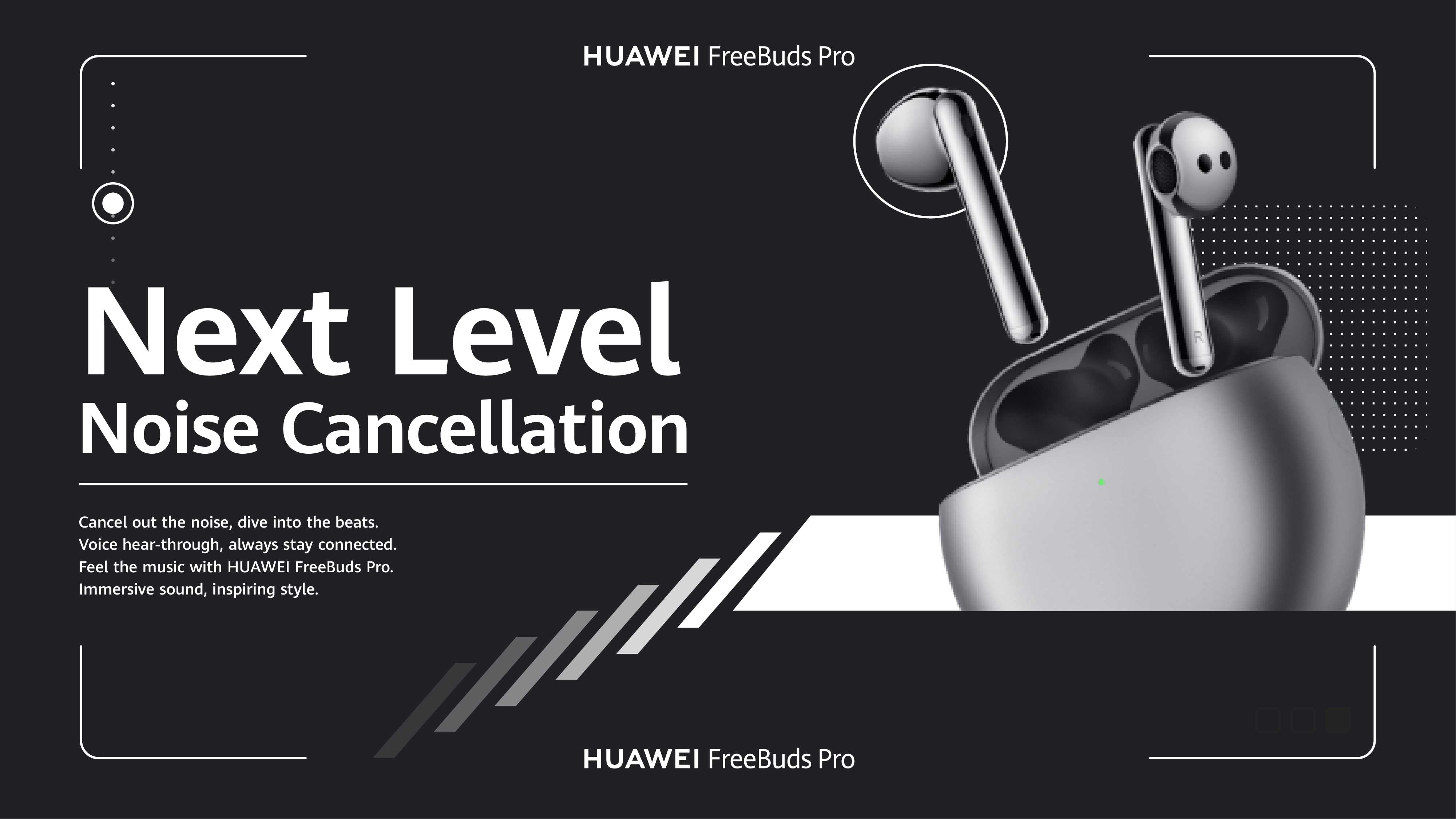
I was asked to lead a small team to pitch a social brand refresh for Huawei's social channels. The challenge was to find a balance between the premium aesthetic and more human tone that could be conversational. We presented the client with some stylescapes to show some overall visual routes. Once the client has picked some routes they were comfortable with we started to explore some key visuals that we could use as our visual guide for future explorations.

This identity, called “Modern Shapes”, was a deliberate shift from Huawei’s traditional feature focused advertising and tech centric design.  My research revealed the brand resonated strongly with older Chinese audiences but had limited engagement with Gen Z.  I wanted Huawei to envision a younger, more tactile social presence.  Our key visual for “Modern Shapes” drew inspiration from shapes found in Huawei’s product line.  For example, the camera notch became a key identifier in mobile devices while the crown dial or face shape defined watches. I developed a graphical system incorporating some of these shapes and imbued them with anthropomorphic personalities through motion.

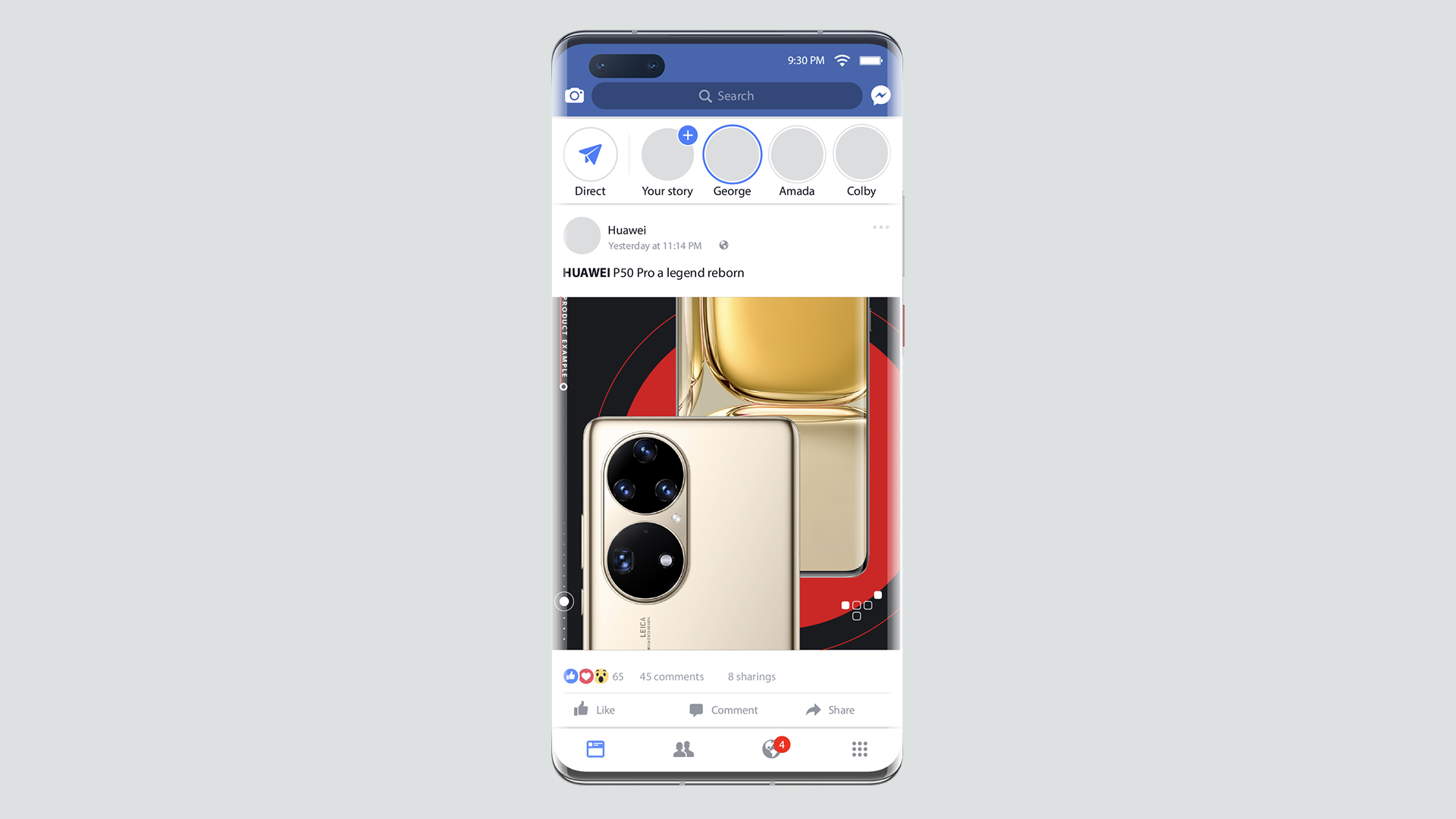
This identity, known as “Futuristic_Red”, offers a more practical approach to visual identity.  Our goal was to highlight Huawei’s existing assets and creatively utilise them. We focused on negative space and Huawei’s red colour, alongside minimalist user interface gestures and icons, to create a tactile digital environment for Huawei’s customer base.